When building your page on a desktop, it's sometimes easy to forget to check how your page looks to users using mobile devices. Mobile users make a significant portion of visitors to your site, so it's important to ensure they have a good experience interacting with your site. Follow these steps to use a desktop to review how your page will look to mobile users.
Steps to review pages in mobile
- Minimize your browser window to the smallest width possible. This will cause the elements on your page to change and mimic what mobile users see.
SiteNow sites feature responsive design, so page layouts automatically adjust to fit different screen sizes and orientations.

- Scroll through your page and review it to see if there are any changes to the page's layout you want to make.
- Since mobile screens are smaller than desktop ones, mobile users will have to scroll more to view your content, so make sure important content is towards the top of the page.
- If you're creating a page rather than an article or a person profile, consider using Layout Builder components like collections to house non-essential information to help reduce the length of the page.
- To learn more about how to edit a page's layout, view the OSC web team's Layout Builder documentation.
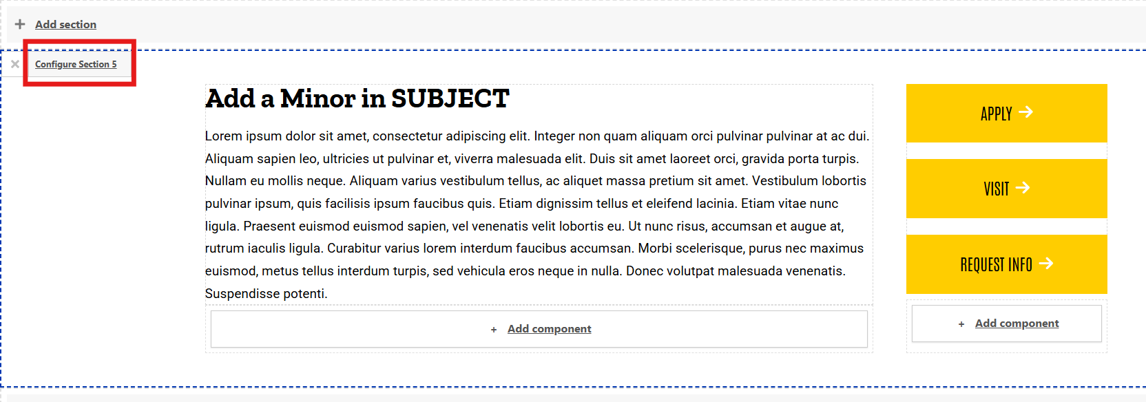
- You may notice that sections with two or more columns display the components in those columns stacked, rather than side by side. If you don't like the order of these components, you can change their order in the Layout Builder.
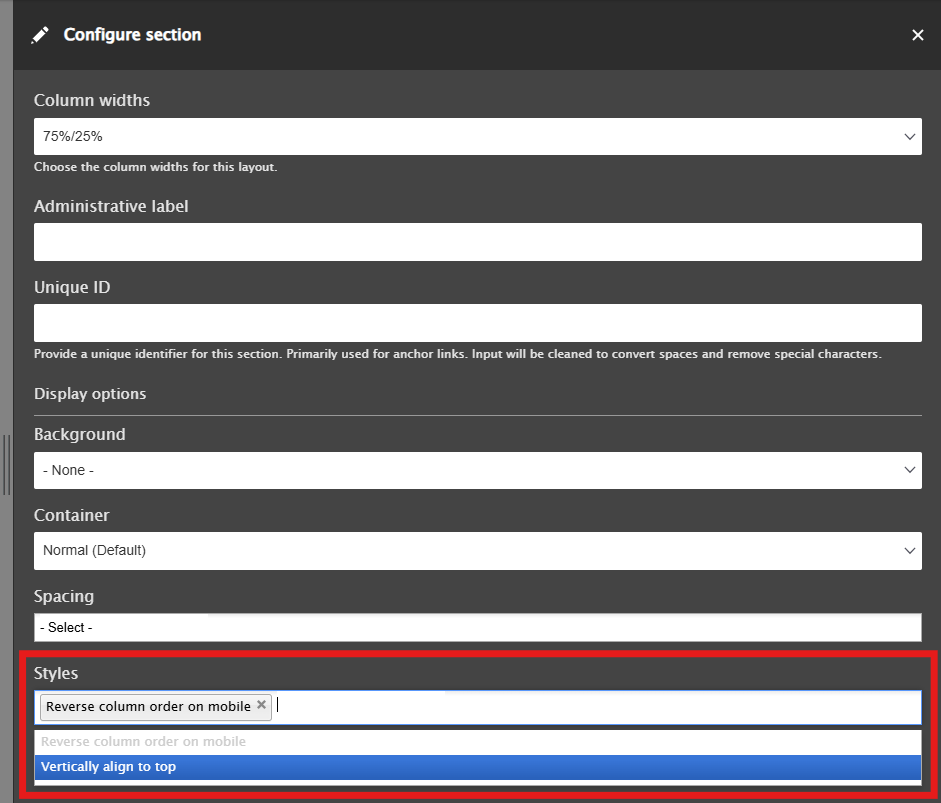
Steps to change column order on mobile
- Open the Layout tab and find the section you want to reverse the column order on mobile.
Move your cursor over to that section and click the Configure Section X button that appears in the top left corner of that section.
- Go to the Styles field and from the dropdown menu select "Reverse column order on mobile"