Buttons are used to make a link visually prominent. Buttons are oftentimes used to help drive a website visitor to take action (called a call-to-action), and can be very useful when encouraging website visitors to take a next step to register, sign up, download a file, etc.

How to create a button

  • In the layout tab, click "Add component" and choose "Button".

    Screenshot of the admin user interface when adding a button component.

Button link settings

  • In the URL field, you typically enter one of these things:
    • If you are linking to another page on your site, start typing the page name and select it from the dropdown menu.
    • If you are linking offsite, type the full URL
  • In the Link text field, type the words you want displayed on the button.
    • Follow these guidelines for writing button text.
    • There is a 25 character limit for buttons
  • You may add up to three buttons in this component by clicking "Add another item" and following the steps for the URL and Link text fields.

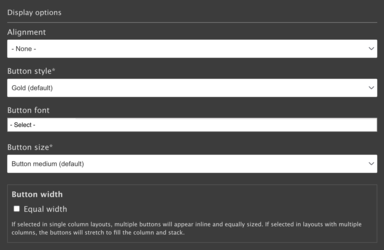
Display options

Screenshot of the button component display option
  • Alignment
    • None: button will appear left aligned
    • Center: button will appear centered
  •  Button style
    • You can choose black, gold, outline, or white (color examples). 
    • All buttons created within the component will have the same style.
      • Black and gold buttons buttons are typically used for the most prominent calls to action. Choose either black or gold depending on the balance of color throughout the rest of the page (if it's mostly black, consider gold and vice versa).
      • Outline and white buttons are typically used for less important links as they tend to blend into the background more.
  • Button font
    • The majority of buttons are left as the default font (-select-) setting. Thin can be used for making a button smaller or less bold, if desired.
  • Button size
    • Adjust the size of the button to balance with the layout of your page.
    • Button medium (default) is the typical setting.
  • Button width
    • You have the option to make your buttons a consistent width--otherwise, they would be the length of your text plus some padding for style.
      • If you place a button component in a single column layout, the buttons will appear inline (horizontally) and be equally sized, pending the number of buttons you create in your component.
      • If you place the button component in a column, the buttons will stretch to fill the column and stack.

Button examples

Four-column section layout, one button per button component, showing all color options, default font, default size (medium), equal width

One-column section layout, three buttons in the component, black style, default font, large size, auto width

Three-column section layout, each column has two buttons per component, white style, thin font, small size. 

Default (left) alignment, auto width

Default alignment, equal width

Center alignment, auto width

Resources for additional learning