Breadcrumb
- Home
- Collegiate Operations
- Marketing and Communications
- Toolkit
- Websites
- How to Training Guides
- Layout Builder
- Call-to-Action Component
How to add a call-to-action component
Main navigation
A call to action (CTA) block should be used when you are wanting to persuade site visitors to perform a desired action on your site. You might want to use a CTA block to invite site visitors to fill out a contact form, to move them to another piece of content or to convince them to explore your site further.
How to create a CTA block
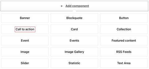
In the layout tab, click "Add component" and choose "Call to action".

CTA link settings
- While a link and link text are required fields for a CTA, the title and summary fields are not required. This allows you to use either or both for your call to action.
- Use the button component if you're not going to use either the title or summary.
- In the URL field, you typically enter one of these things:
- If you are linking to another page on your site, start typing the page name and select it from the dropdown menu.
- If you are linking offsite, type the full URL.
- In the Link text field, type the words you want displayed on the button.
- Follow these guidelines for writing button text.
- There is a 25 character limit for buttons
- If your desired text is longer than 25 characters, you could consider creating a button within a text component. This approach has a slightly different style, but allows for longer display link text.
Display options
- Alignment
- None
- Flex row center (will center the entire block and fields)
- Left
- Background
- You can add a background of black, gold, brain pattern black, or gray to draw additional attention to your CTA.
SiteNow documentation
Learn more about the call-to-action block in the SiteNow Layout Builder documentation.
Call to action example
